New PayPal Checkout Page

Old Cash Register

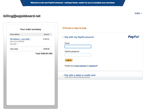
I was just making a payment via PayPal and discovered that PayPal have a new checkout page.

Here it is with the payment via PayPal option showing (this is the default for people who already have a PayPal account):
As before, those who don’t have a PayPal account are instead prompted for credit card details:
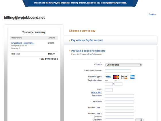
The pages have a slightly more up-to-date feel than the previous PayPal pages and there are now some slick javascript transition effects as you toggle between PayPal and credit card payment options and step through the rest of the checkout flow.

It’s good to see PayPal making some small steps forward with their user experience.

Let’s hope they update their back-end admin site next. (In my opinion, it’s appallingly slow and cumbersome.)

Creative Commons License photo credit: Jo Jakeman


Comments

10 responses to “New PayPal Checkout Page”

  1. Andreas avatar
    Andreas

    Just discovered the new page while going online with our new site.
    Unfortunately the new page breaks the process as post parameters are no longer passed to the success return page; was working fine with the old page style .-(
    Any ideas how one can force the usage of the old page style – at least until this bug is fixed?

  2. Mukesh Variya avatar
    Mukesh Variya

    Hello,

    I am having the similar kind of problem.

    When I come to this page, I found strange – some time it shows older page and some time if shows this new look.

    Its totally disappointing me to work with PayPal and having lots of issues.

    I understand that paypal is moving on next step but this makes more problem with me to provide live payment gateway for my customers.

    I dont know why some time comes older look (much better and works 100% fine) when new look, when I try to login I just have to wait and wait and wait…

    Not happy at this moment.

    Thanks
    Mukesh

  3. What I really don’t like about the new design is that the first page that is seen upon checkout, “Choose a way to Pay” centers the pay with Paypal, and the pay with credit card is hard to find. I found it very difficult to see at first. I know its driving customers away. If I can’t easily see how to pay without a Paypal account, and I am quite familiar with Paypal, then how are new customers finding it?

  4. YourWebGirl avatar
    YourWebGirl

    @EJ, Hi EJ that is my gripe I’ve been looking all over trying to find it would you let me know where it is? Re: “Choose a way to Pay” centers the pay with Paypal, and the pay with credit card is hard to find.

  5. EJ, YourWebGirl,

    Thanks for your comments. I think the situation’s actually better than it first appears…

    The PayPal checkout page emphasises different things to different users. If you clear all PayPal cookies from your browser and revisit your checkout page you’ll see a page where the credit card fields are very obvious. Anyone who doesn’t have a PayPal account presumably gets shown that version.

  6. Paypal checkout error

    Unfortunately the new page breaks the process as post parameters are no longer passed to the success return page in new page style; was working fine with the old page style.

    Any ideas about to overcome this error.

    Thanks.

  7. Hello How to choose this new checkout page .I am using old default page style (classic checkout page).I want to change enhanced checkout .How to change ?pls tell me .Thank you

  8. Hi Mohamed,

    According to this discussion there’s no way to force one style or the other.

  9. Since the new checkout page started
    I’m unable to make ebay payments.
    and sellers are getting mad.
    The new checkout page is very confusing.
    Nice going Paypal!

  10. Now my Paypal checkout page is working!
    I have no idea why it started working after
    a day of not working.

Leave a Reply

Your email address will not be published. Required fields are marked *